One positive side effect of being a professional photographer in the 21st Century, is the capability of producing Graphic Design work – at least a basic level. Photographers are now required to be skilled at Photoshop, which is a hugely powerful programme. As well as using Photoshop to turn a photo of a pizza into an attractive model (seriously: YouTube it!), you can also create all sorts of graphics for print.
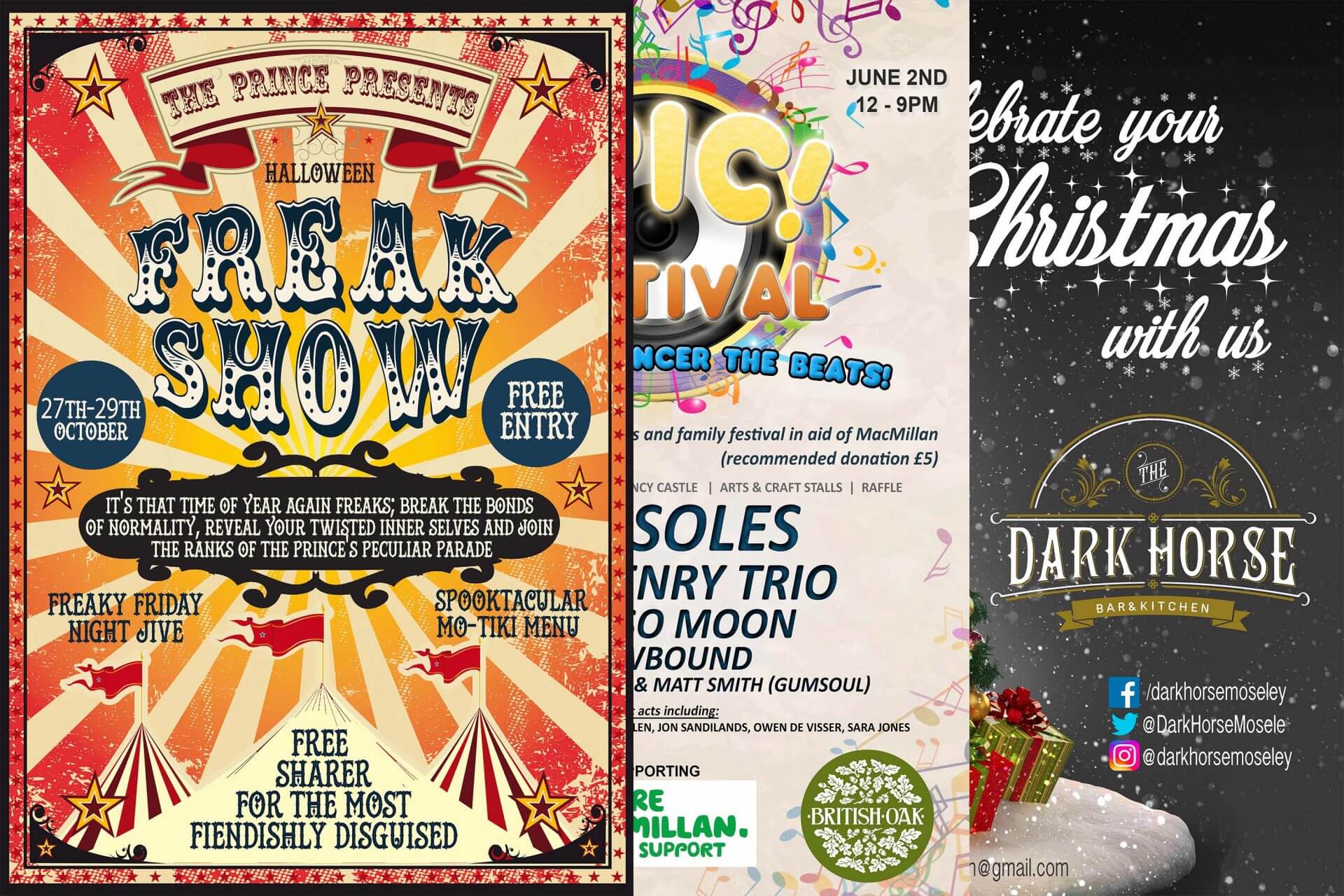
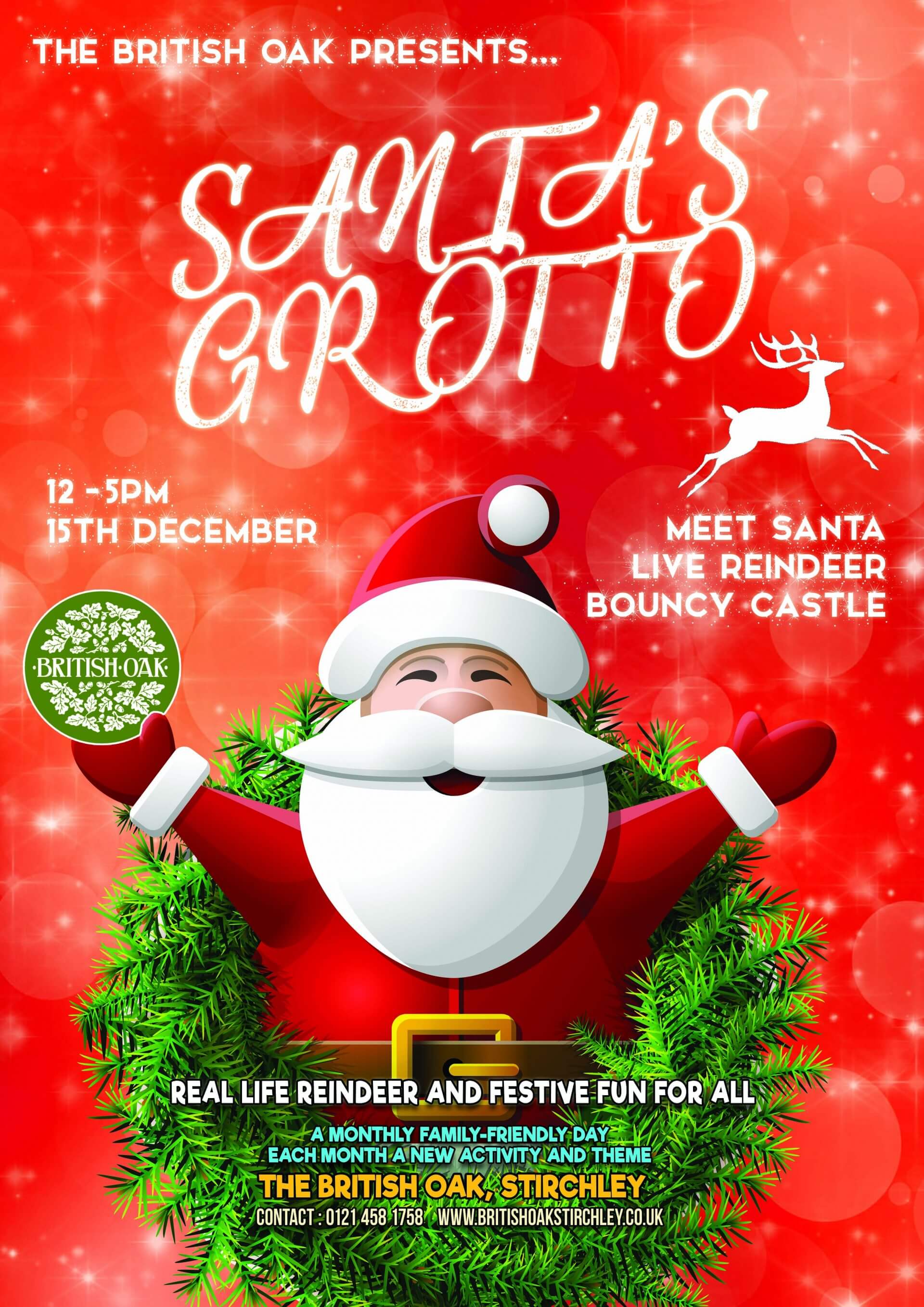
For the past 5 years I have been creating posters, logos and menus for a host of small businesses. My regular clients include The Prince of Wales (pub of the year 2016), The Dark Horse & The British Oak. With their array of regular events, this side project keeps me busy with a few extra jobs per month.
These clients are fairly flexible in terms of final poster design. They need to usually be A3-shaped, include their text, information and logo, but I am left with most creative control.
These posters can be family events, quizzes, festivals or gigs. Menus can be for food or drinks.
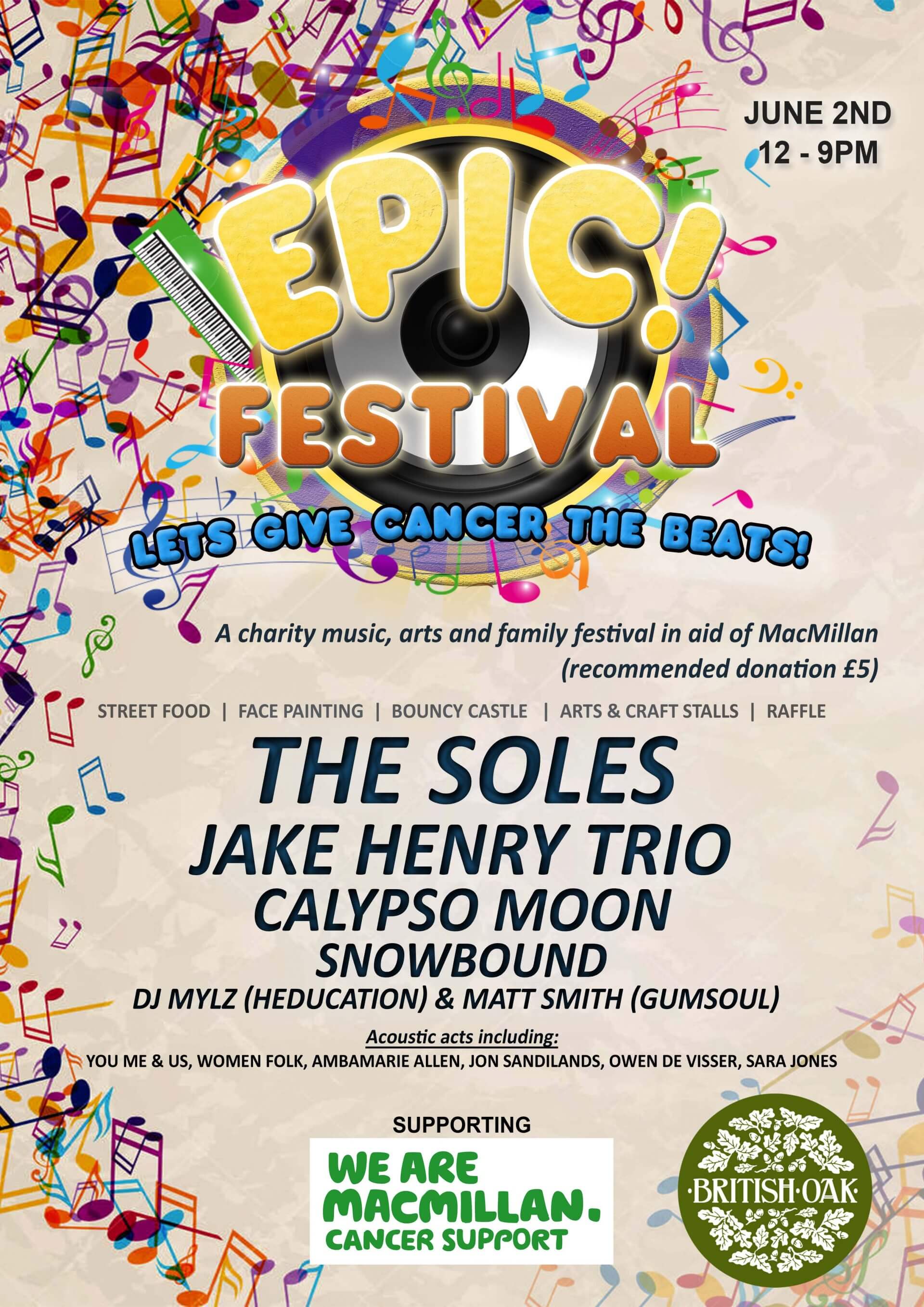
I try to make every poster look different and distinctive in design. My aim is for each poster to stand out against each other, and not blend into one style. They essentially look like each poster has been created by a different designer, reflecting the variety of events these businesses offer.
The posters are created using a background, a myriad of fonts and licence-free imagery. Some are inspired by exiting art works (like films) and others are made completely from scratch with my own photography. They are all created on Photoshop, using layers, effects, blending options and cut/paste features. Reoccurring events are rehashed, updated with new dates/details, but sticking to a recognisable theme. This makes it easier to target returning customers.
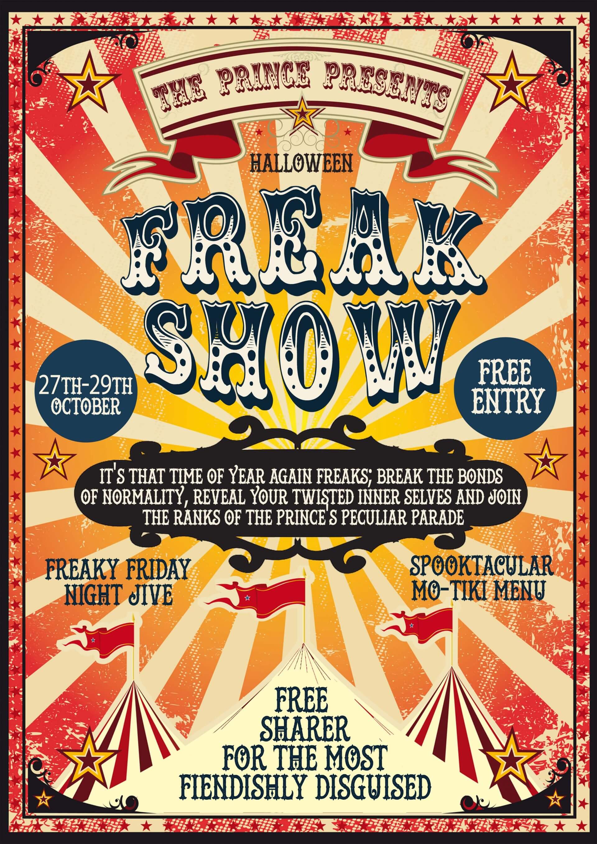
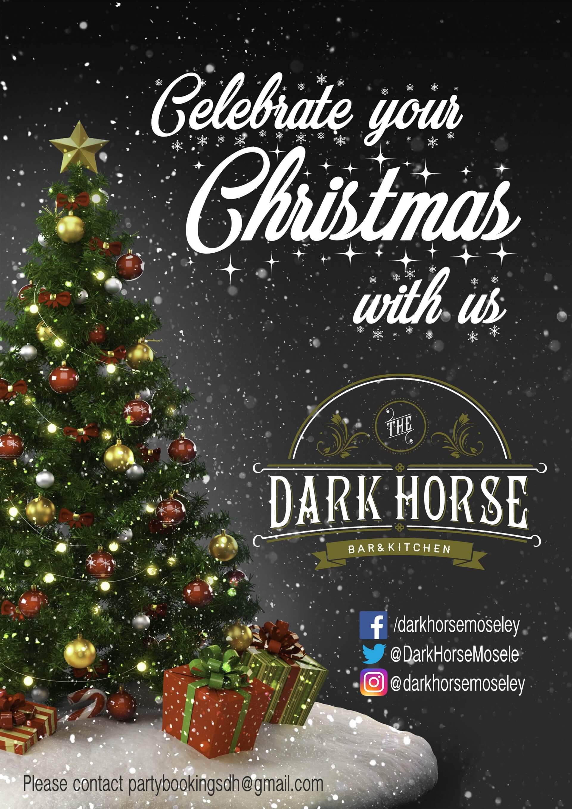
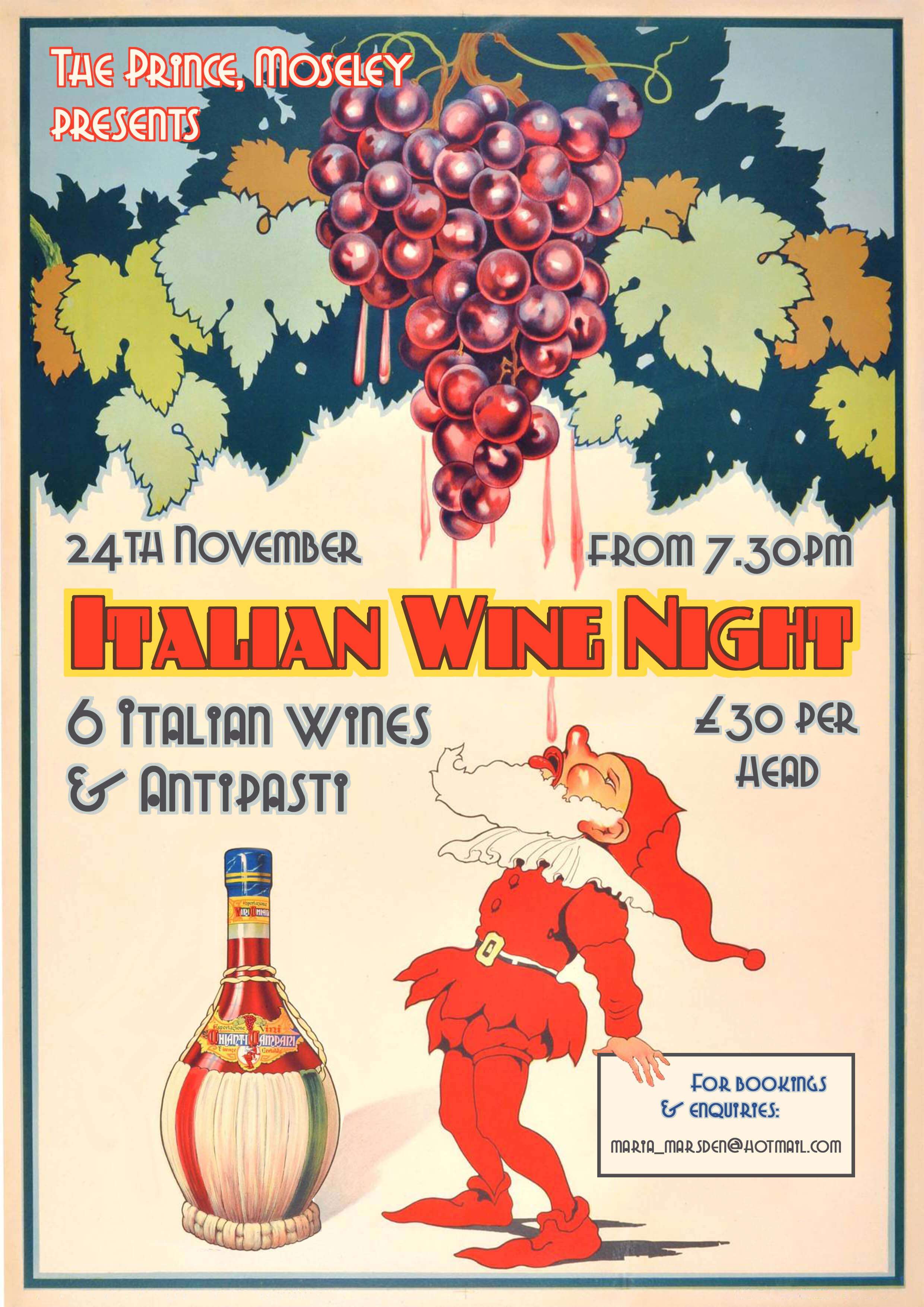
To set up to create a poster on Photoshop, you need to make sure that you know the final purpose of a project. You cannot create a small, square design, and then turn it into a large, rectangular poster for print. As Photoshop works in pixels, simply enlarging an object just makes each pixel bigger – and results in blocky (pixelated) unclear images. Thus, I start with a canvas of 29.7x42cm – the exact size of A3. This can always be reduced to A4/A5 afterwards, if the client wants to print flyers too. DPI (dots per inch) should be set to 300dpi, for maximum print quality. There are ways of then changing this format into a square shape (for Instagram, for example), but it can get a bit messy, with significant rearranging required.
The rest is just about layering. It’s like creating a painting – start with the background. This is either a colour or a picture. Maybe add some gradient, to stop it looking too flat. Little touches all add up.
Then add some eye-catching imagery. If the poster is for a cider festival, add some apples/cider/trees. Your potential customers may only see this poster for a second, so it needs to catch their attention! There are tonnes of licence-free images available from a host of websites, or some even better pay-per-use images (budget permitting). Then add text: A brief description, the dates, venue and anything else the client specifies. Make the text stand out by using blending options. This allows for drop shadows, gradients, textures etc, to make the text look appealing and less dull.
Everything on the poster should be clear and not too close to the edges. Sometimes posters are put in clip frames, so leave some room around the sides. Text should stand out against the imagery, so use of colours here is very important. It should also be legible!
That’s about it – Your eyes do the rest. Each event and brief are slightly different, but if you are creative enough inspiration should come quickly. You don’t even have to know how to draw.
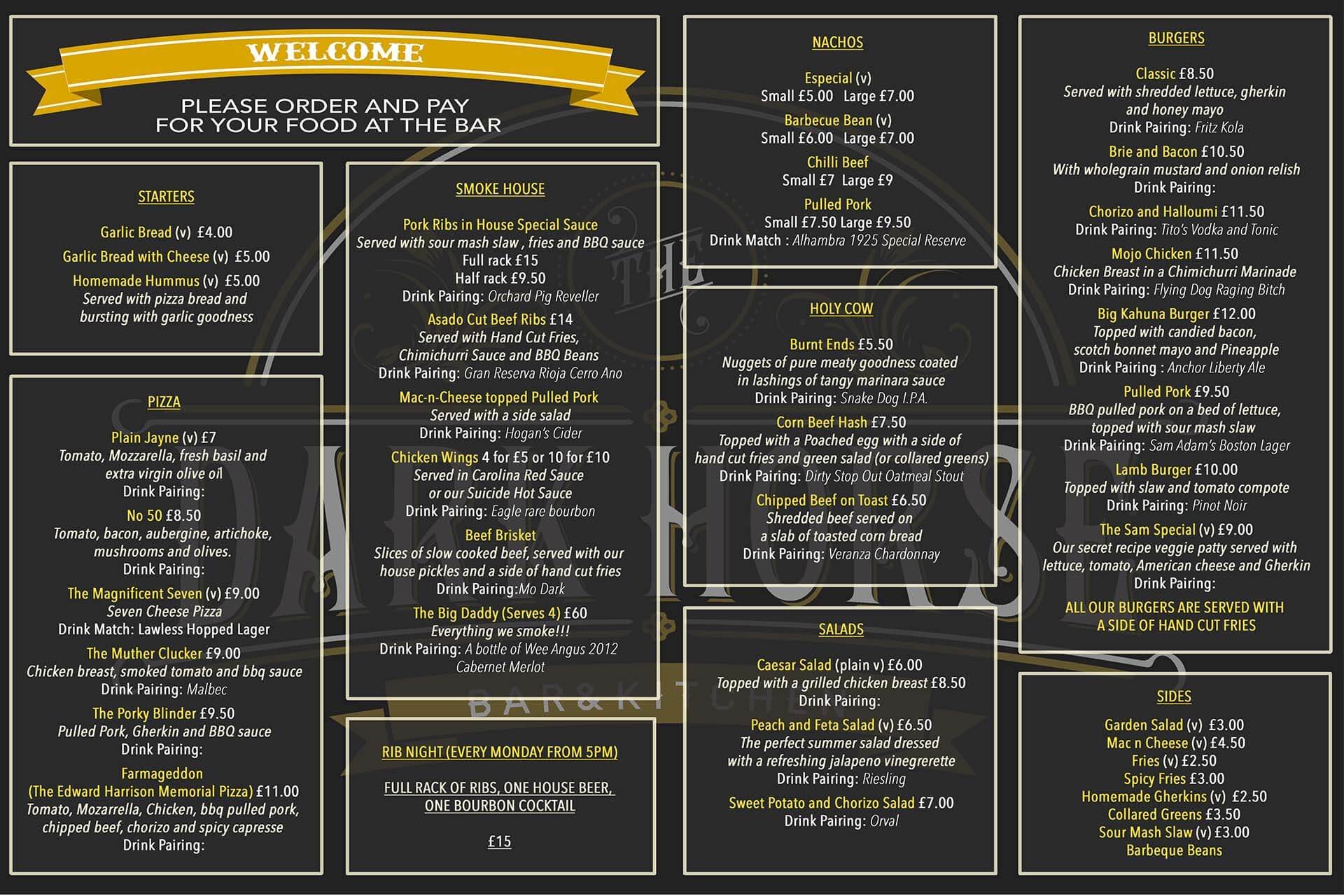
Menus are a little different from posters (see below). They require further precision and must be legible and precise when held in the hand. They are less about being eye-catching, with more focus on accuracy.
My current graphics workload is around one job per week. But I don’t sell myself as a graphic designer. I am a photographer first and foremost. It just adds another string to my bow and variety is the spice of life
For information, my other graphics clients have also included Deliveroo, EPIC Festival and The Hop Merchant
